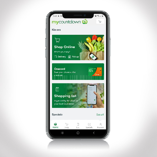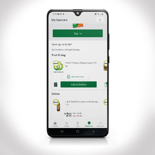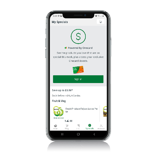
Specials HUB
Countdown mobile App
The problem(s):
• User engagement is not increasing.
• There is not enough personalised offers.
• Confusion between Specials and Great Prices offers.
• Customers find the Specials HUB page overwhelming and busy.
• 12,000 average sessions are recorded at the Specials HUB with less conversion.
User expectations:
• Easily find the needful offers that meet my requirements.
• It's unclear to choose between Specials and Great Prices.
• Effortlessly understand the promotional price and can choose the product that gives the best value.
• Ensures my purchase is correctly charged (and delivered) or provides me the availability at my nearest store for pickup.